It is a common sense that:
the width of a box = width + margin-left + margin-right + padding-left + padding-right + border-left + border-right (rule 1)
based on the box model in CSS. However, there is one more thing to add:
the default width of a block-level element always = the width of its parent element (rule 2)
until a width is set. Setting width makes a structure less flexible, especially when it refers to a px unit. Let’s go to a simple example, we have such html code bellow:
<div>
    <p>blabla</p>
</div>
with a css style:
 div{
     border: solid 1px black;
 }
 p{
     border: solid 1px black;
 }
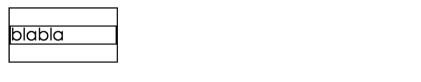
As expected, the result shows as following:

Here we have a clear html structure: html->div->p, which are all block-level elements. As initialed, the html element has a 100% width of the window by default, thus, the child element div got the same width as his parent, width:100%, and so does the child p element applied rule 2 above. If the width is set by an author:
 div{
     border: solid 1px black;
     width:100px; /* the width is set */
 }
 p{
     border: solid 1px black;
 }
The whole visual formatting changed as bellow:
However, a width definition of a child element has no effect on its parent, it doesn’t have the control:
 div{
     border: solid 1px black;
 }
 p{
     border: solid 1px black;
     width:100px; /* the width is set */
 }
Result:

You can change the width of the box of the p element by assigning a padding or margin value to it:
 div{
     border: solid 1px black;
 }
 p{
     border: solid 1px black;
     width:100px; /* the width is set */
     padding:100px; /* the padding is set */
 }
By using the power of padding, the redundant div tag could be removed, if your goal is to creating a box like this:

The whitespace of the border and the centered form could be made simply by using a padding instead of alot of sizing and centering work.
Here, another way of determining the size of an element is called Block Formatting Context(BFC) mentioned in CSS Mastery which is often used for the height collapse problem of the blocks with floated children. Conversely, the mechanism goes the posite way from the nomal formatting. When an element is triggered with the BFC, it is responsible for sizing and positioning itself and its children. It common with the widely known hasLayout feature in IE browser. That means it decides it size(width and height) and position based on its children instead od its parent. We can see it from the height collapse problem, suppose we have a list:
<ul>
    <li>1</li>
    <li>2</li>
    <li>3</li>
    <li>4</li>
</ul>
and style sheet:
ul{
    border: solid 1px red;
    text-align:center;
    vertical-align:baseline;
    list-style: none;
}


li{
    border: solid 1px black;
    float:left;
    margin:100px;
}
Result:

we mark the border of ul as red so that to identify the parent element, we can see that the height is collapsed. Why does this happen?
While the width of an element is determined by its parent’s width, the height of it is enclosed by its children, with a prerequisite that the children are in the normal flow. Setting an element a float style(this happen in absolute positioning as well) takes it out of the normal flow-positioning model, while the parent element is still in the flow. The parent cannot find any children in its normal flow model, thus the height gose to zero when enclosing the box, like how you see in the pic above.
A popular solution to this problem is setting an overflow:hidden style to the perent. And that is where Block Formatting Context is triggered. As we mentioned:
When an element is triggered with the BFC, it is responsible for sizing and positioning itself and its children.
The word responsible explicates how the BFC works: it is forsed to cauculate the height based on its children’s height no matter if they are in normal-positioning flow or not. A block formatting context is created by one of the following:
- float other than none
- position fixed or absolute
- display inline block
- table cells (elements with display: table-cell, which is the default for HTML table cells)
- table captions (elements with display: table-caption, which is the default for HTML table captions)
- overflow other than visible
- flex boxes (elements with display: flex or inline-flex)
Notice here the trigger is about the parent, that means, the float, absolute psition, or overflow:hidden is set to the parent, we can see the results:
By set overflow: hidden:
 By set float: left or position: absolute:
Summary
Those are almost the main machenisms of the Visual Formatting Model in CSS. And here are the three formatting models in CSS: normal flow, absolute positioning, and floating. We can figure out the first one by rule 1 and rule 2 in the artucle, while the last two is a little more complicated to figure by the Block Formatting Context. There are always multiple solutions when dealing withe css problems, it is a good way to practice and learn from the cases.